Election Maps
The results of elections are usually displayed on maps. These maps show geographic space, with results per town or province. Like any data visualization, these maps are limited. They most often color spatial units by the winning party. Maps turn blue if the liberals win, red if socialists (hypothetically) do or brown if the middle classes have fallen for the fascists again.
With the volatile electorates of today, these maps often give the impression of landmark shifts and fundamental breaks with the past.
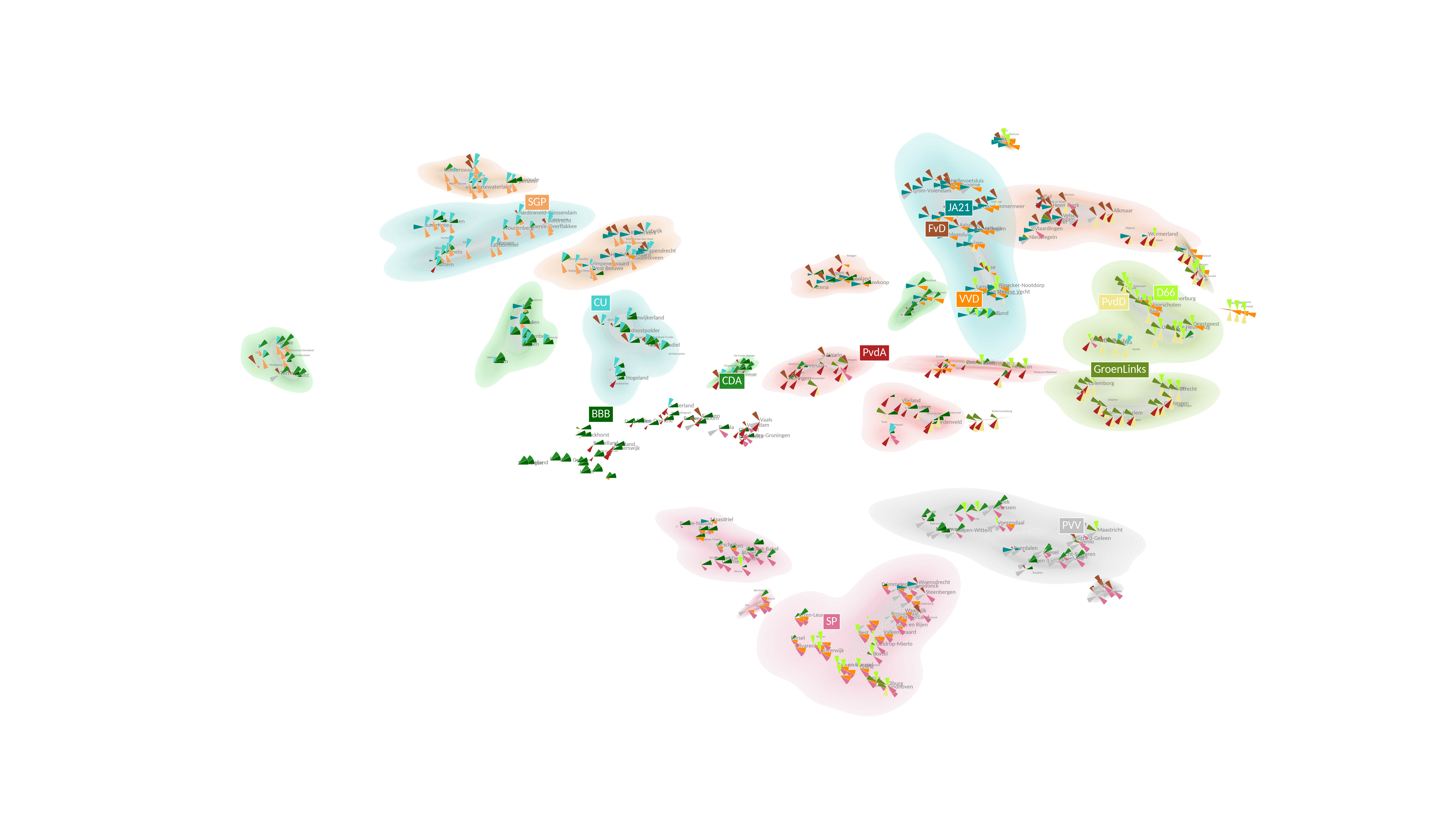
From a data visualization perspective, the question is thus how to better visualize results. One interesting approach is taken by data visualization specialists Moritz Stefaner. In his “Wahlland” project (2013) the election data itself is used to create space. In this space, similarly voting constituencies are clustered together. A new Wahlland appears, structured not by geography, but by the voting outcomes.
The approach not only generates beautiful maps, it is also a way to explore political geography in closer detail. I therefore set out to reproduce the maps for the Dutch context. Below follows a step-by-step guide.
The Data
I scraped the data from the Dutch Election Result Database. After some curation, I have this type of table:
| party | share | place |
|---|---|---|
| BBB | 30.0 | Eemsdelta |
| PvdA | 9.2 | Eemsdelta |
| SP | 7.0 | Eemsdelta |
The parties in this table are cleaned and only the top 13 most frequent parties are kept. In a separate .json file, I have manually cleaned the parties, so that “Partij van de Arbeid” becomes “PvdA” and local parties like “Ouderenpartij Noord-Holland” are set to “LOK”. The vote shares per place (municipality) sum to 1.
Creating the Election Space
The long-format table is then pivoted to a wide-format table. Then, the results are standardized on the parties. This is important, because the map thus forms on the basis of party-level results.
rdp = df.pivot(index='place',columns='party',values='share').fillna(0.0)
rdp = rdp.apply(zscore, axis = 0)
If you now sort the table by party, rows with places where that party has the highest above-average performance are ranked first. In the case of BBB, the new farmer’s party, this results in the villages of Tubbergen and Dinkelland, where the party got a staggering 61% and 55% of the votes, rank first. Cities like Amsterdam, Leiden and Utrecht rank last.
To produce the election space, I run tSNE on the party-place outcome matrix, putting the coordinates a new DataFrame. I also store the top party for that place in a separate column:
tsne = TSNE(2,perplexity=5)
tsne_result = tsne.fit_transform(rdp)
tdf = pd.DataFrame({'x': tsne_result[:,0], 'y': tsne_result[:,1], 'place': rdp.index, 'mx': rdp.idxmax(axis=1).tolist()})
Visualizing these scatterplots is a bit tricky, since stretching the figure to landscape proportions (16 x 9) leads to weirdly looking data points. The best way to avoid this, is to rescale the coordinates already here.
# Transform
minx,maxx = 0,100
miny,maxy = 0,180
scalerx = MinMaxScaler(feature_range=(minx, maxx))
scalery = MinMaxScaler(feature_range=(miny, maxy))

tdf['x'] = scalerx.fit_transform(tdf['x'].values[:, None])
tdf['y'] = scalery.fit_transform(tdf['y'].values[:, None])
The last preprocessing operation is to cluster the points, to be able to show dense areas in the eventual plot. I use DBSCAN for this:
tdf_coo_values = tdf[['x','y']].values
clustering = DBSCAN(min_samples=1,eps=6).fit(tdf_coo_values)
tdf['l'] = clustering.labels_
tdf['l'] = tdf['l'].astype(str)
Visualizing
Now I have all resources for the plotting:
- the coordinates of the places
- the party-place dataframe with standardized vote shares on the party-level
- a dictionary with colors related to each party (I created this manually as well)
I then create a matplotlib figure and axis and populate them with:
- Pie charts for each place, with the pie “slices” proportional to the z-score of the party.
- Place names.
- Density plots for each cluster, so that a colored shade indicates dense areas for specific clusters (often tied to parties).
- Labels for every party located at the centroid coordinate.
Assuming a matplotlib environment, the elements are added as follows:
Pie Charts
for i, r in tqdm(tdf.iterrows()):
    place_dist = {p: max(0, s) for p, s in rdp.loc[r['place']].to_dict().items()}

    mc = Counter({p: s for p, s in place_dist.items() if s > 0}).most_common(3)
    mc_keys = dict(mc).keys()

    sizes = [1] * len(parties)
    colors = [pcmap[party] for party in parties]

    wedges, labels = ax.pie(x=sizes,
                            colors=colors,
                            center=(r['y'], r['x']),
                            labels=parties,
                            frame=True,
                            wedgeprops={"edgecolor": "white", 'linewidth': .1, 'antialiased': True})

    for w, l in zip(wedges, labels):
        if l.get_text() in place_dist:
            rad = min(place_dist[l.get_text()] * 2, 2)
            w.set_radius(rad)
        if l.get_text() not in mc_keys:
            w.set_alpha(0)
        l.set_text('')
Density Plots
for l, d in tdf.groupby('l'):
    party = Counter(d.mx.tolist()).most_common(1)[0][0]
    if d.x.var() < 150 and d.y.var() < 150:
        try:
            sns.kdeplot(data=d,
                        x='y',
                        y='x',
                        fill=True,
                        levels=50,
                        ax=ax,
                        color=pcmap[party],
                        alpha=.2,
                        zorder=-50)
        except:
            continue

ax.set_xlim(tdf.x.min() - 1, tdf.x.max() + 1)
ax.set_ylim(tdf.y.min() - 1, tdf.y.max() + 1)
ax.axis('equal')
ax.axis('off')
Party Labels
margins = list(np.arange(0.5, 1.5, .115)) + list(np.arange(-1.5, -.5, .15))

for party, d in tdf.groupby('mx'):
    if party in parties_to_plot:
        mx, my = d.x.median(), d.y.median()
        pt = ax.text(s=party,
                     x=my + (random.choice(margins) * 4),
                     y=mx + (random.choice(margins) * 3),
                     color='white',
                     bbox=dict(edgecolor="white", linewidth=.5, facecolor=pcmap[party], boxstyle='square,pad=.25'),
                     fontsize=8)
Place Labels
texts = []
plotted_places = []

for clust, d in tdf.groupby('l'):
    d = d.reset_index(drop=True)
    mx, my = d.x.median(), d.y.median()

    if len(d) > 5:
        d = d.sample(5)

    for i, r in d.iterrows():
        txt = ax.annotate(text=r['place'],
                          xy=(r['y'] - random.choice(margins), r['x'] + random.choice(margins)),
                          color='grey',
                          zorder=-1,
                          alpha=1,
                          fontsize=4)
        plotted_places.append(r['place'])
        texts.append(txt)

for i, r in tdf[~(tdf.place.isin(plotted_places))].sample(150).iterrows():
    txt = ax.text(s=r['place'], x=r['y'], y=r['x'], color='grey', zorder=-1, alpha=1, fontsize=4)
    texts.append(txt)
The Result
The result looks as follows.
